Typography.
Typography.
In these projects, I explored how typography can be utilized as a powerful tool for design. Each project showcases a unique approach to typography, focusing on elements such as font selection, hierarchy, spacing, and alignment to create visually compelling designs. These experimental-type compositions demonstrate a balance between creativity and functionality.
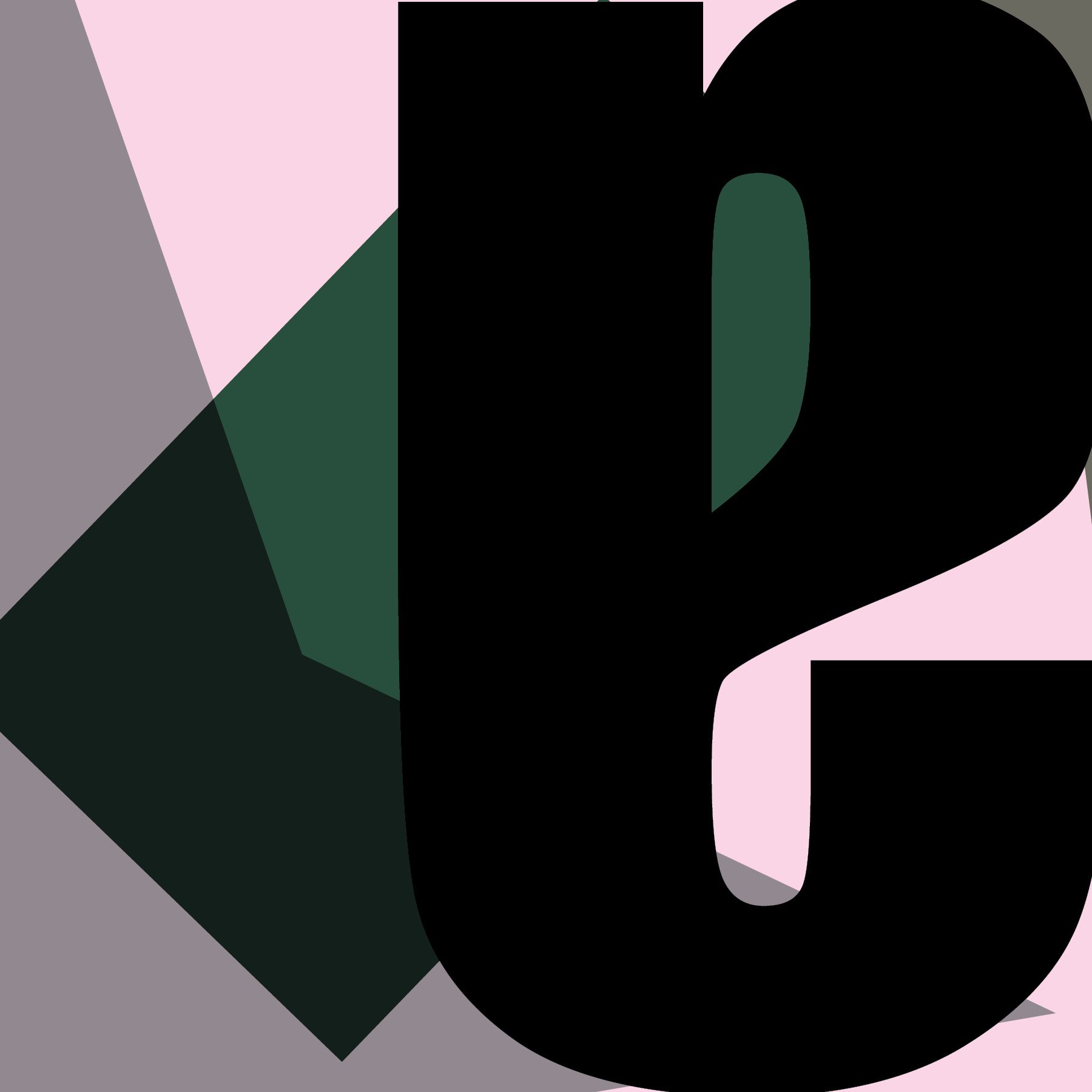
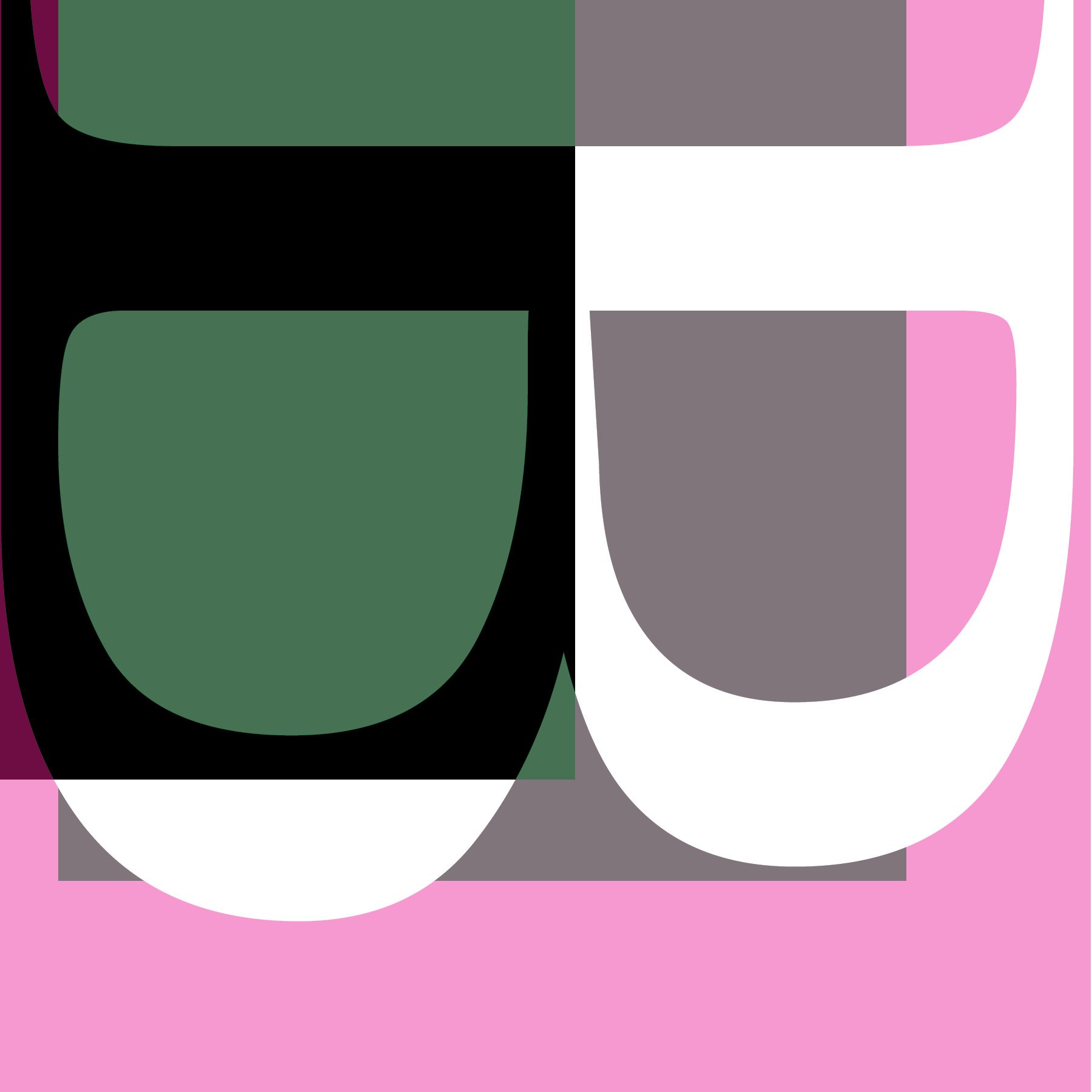
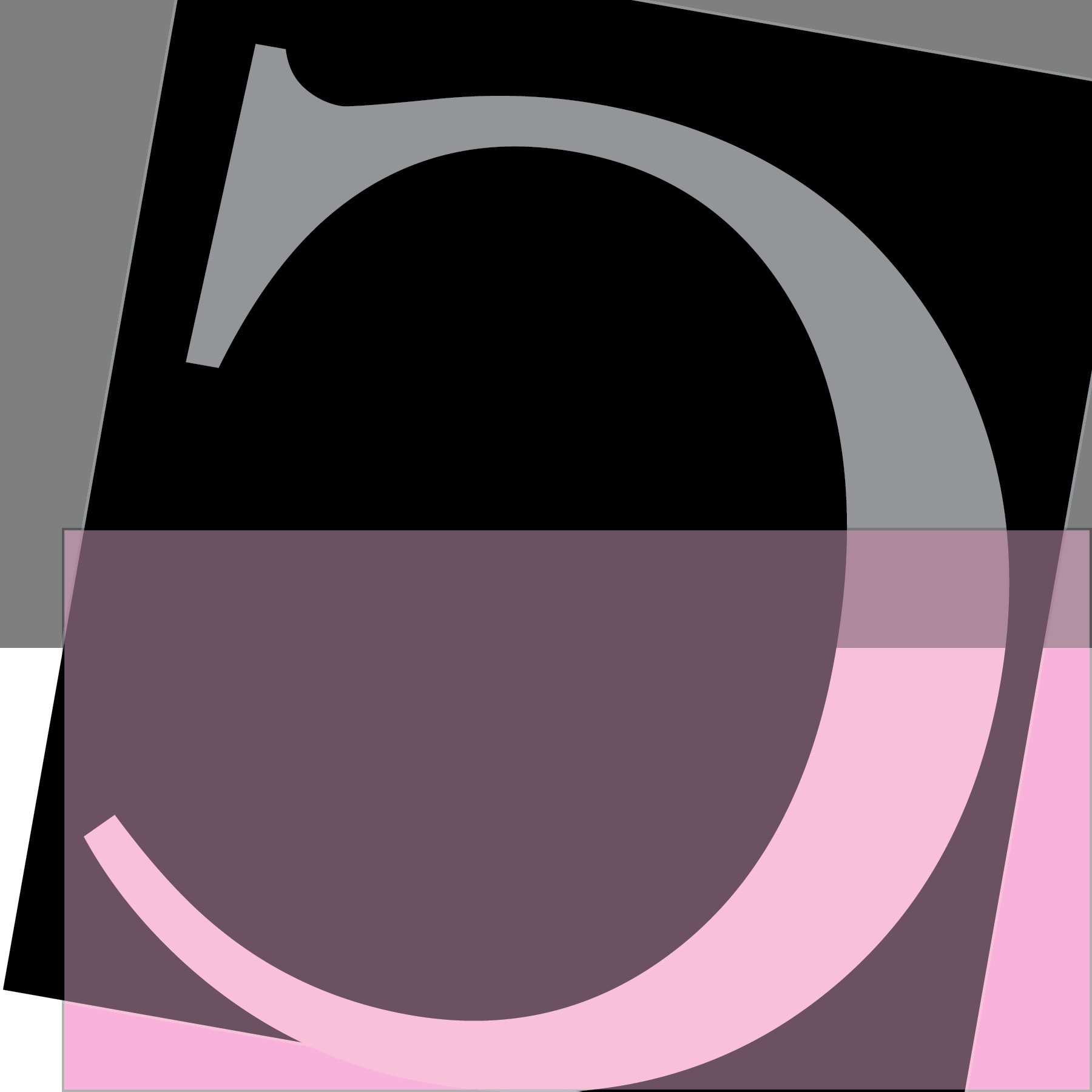




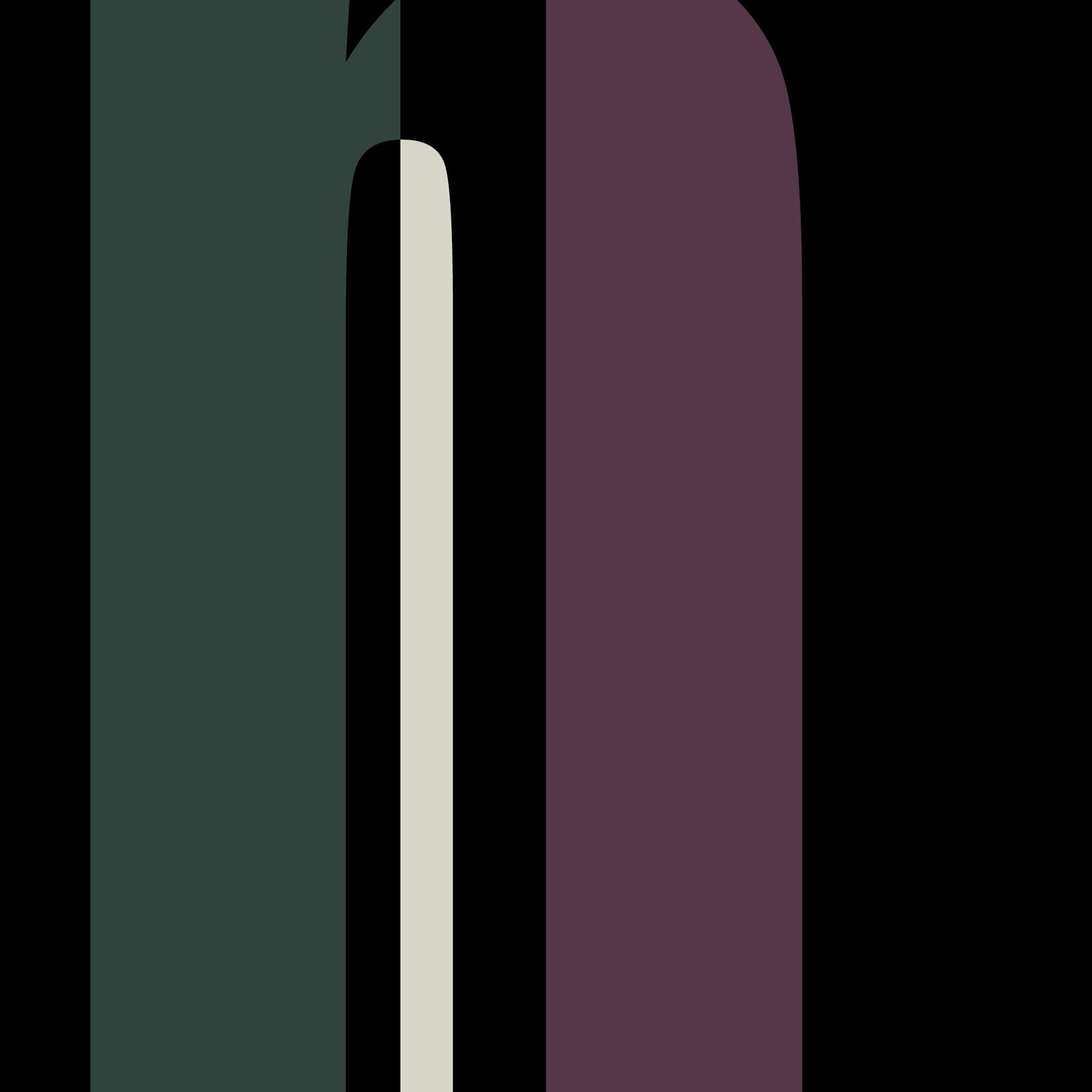
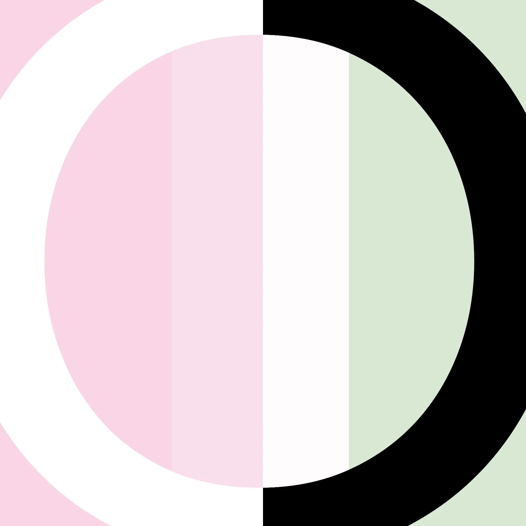


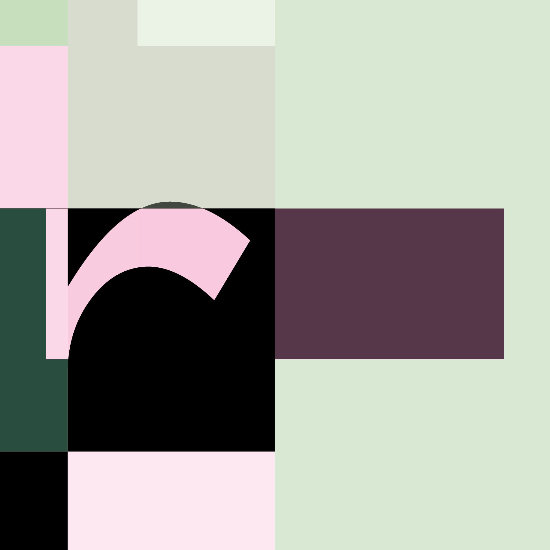


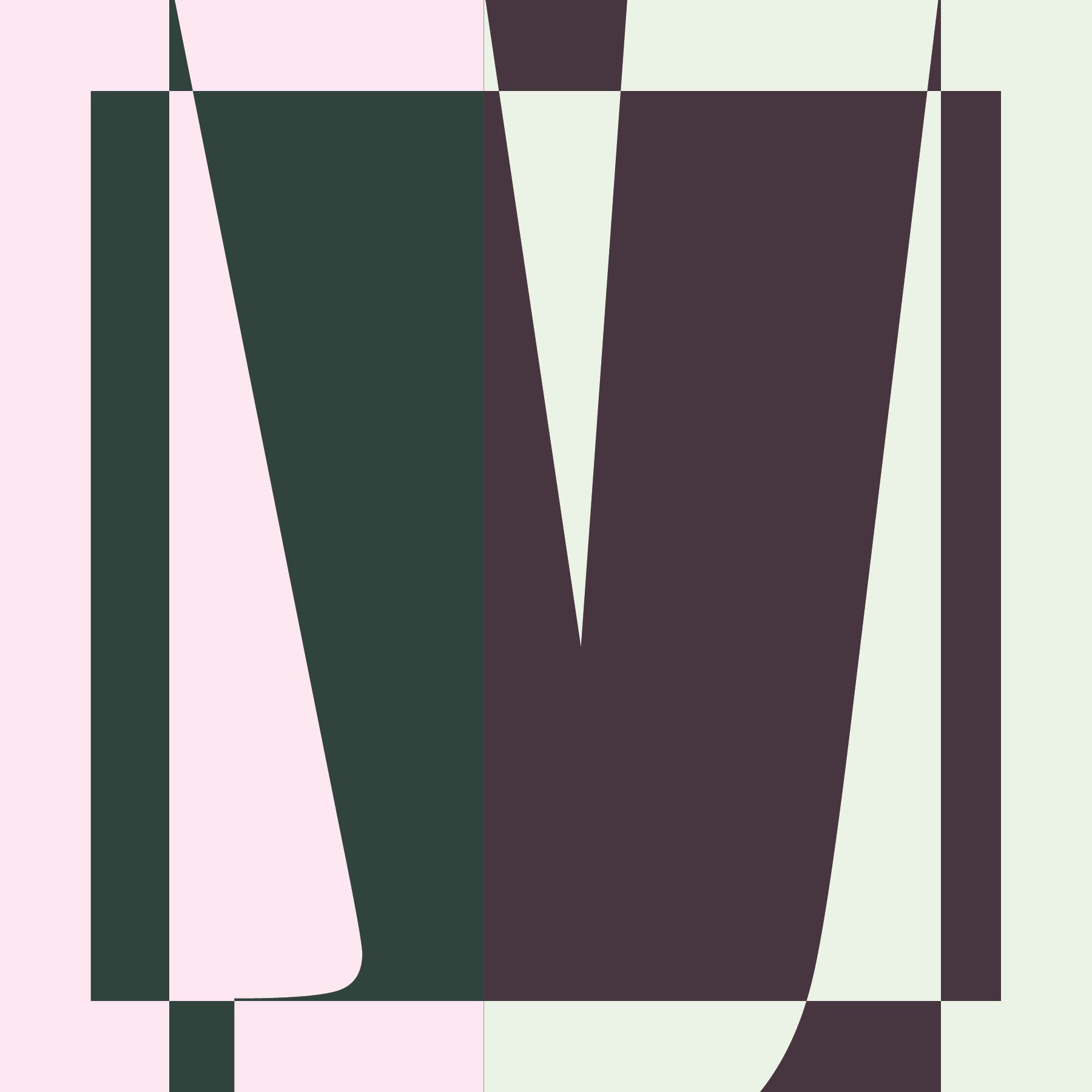

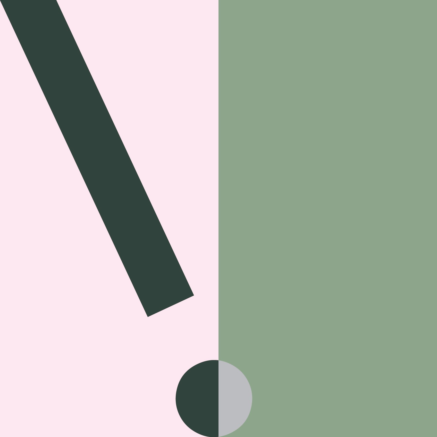


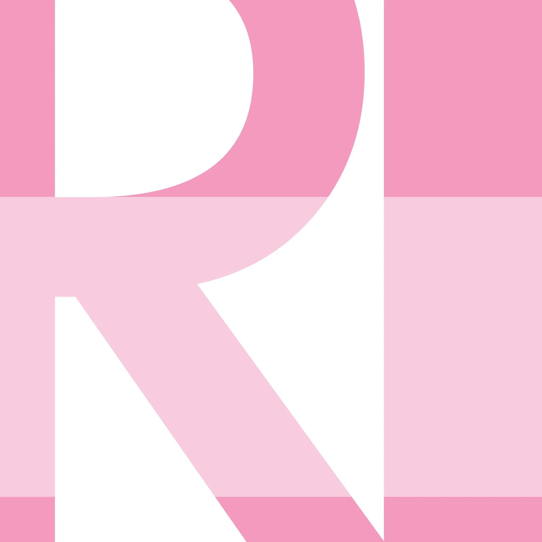


I created a 36-page, 6"x6" document in InDesign, with facing pages turned off. The design uses six typefaces: Helvetica Neue, Impact, Avenir, Minion Pro, Futura, Gill Sans, and Times. Each page is filled with an abstracted letterform from one of these typefaces. The objective was to treat the letters as abstract shapes, focusing on the interplay between positive and negative space.
The compositions explore a range of approaches, from recognizable forms—where the letter is clearly identifiable—to highly abstracted designs, where only a fragment of the letter's curve or structure is visible. Both uppercase and lowercase letters were used, and some pages mix and match these styles to enhance visual variety. The aim was to create intriguing compositions that push the boundaries of typographic form.
I created this project for ART 346: Basic Graphic Design. This project, titled Soda, explores the world of typefaces through the lens of soda. It showcases how typography can be systematically classified and interpreted based on unique characteristics. Inspired by the concept of typology—the study of traits and systematic classification—this book imagines typefaces as various soda flavors, each with its distinct personality and style.
The 56-page book integrates my studies of letterforms as a visual foundation, complemented by engaging text that brings each typeface to life. The pages are thoughtfully designed to balance creativity, typography, and print design principles. For this project, I used Adobe InDesign and Illustrator.
